Mobile Website Design – Then vs Now
- July 10, 2025
- Bradley Taylor
Having been in the website design industry for almost 25 years, I’ve seen a great deal of growth. In the early days we built websites out of html using tables and images. Then came the introduction of cascading style sheets (CSS) which helped websites have a little more functionality. Eventually, implements like flash, java, and python took website design to the next level.
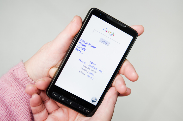
Mobile web design took a little bit more time to come around. This was due to the fact that mobile browsers were very rudimentary. Early web browsers were very limited in what they could display. Large images would crash the browser. So, we would create a separate website which would run alongside of the main one. These mobile websites would be very simple.
Early mobile websites usually consisted of simple tables and text. You could include images too, but they had to be small and very low resolution. If the server detected the visitor was using a mobile devise it would send them off to the simplified website. Detection was made using JavaScript embedded in the heading code of the site.
As mobile devices grew in capability so did the mobile websites. Eventually, with the advent of smart phones, a person could actually view more complex websites without a problem. But the text was usually small and required the users to manually zoom in.
“Mobile-friendly” websites were the next step in evolution and is where we are today. A good website is dynamic and will automatically resize text and images to optimize user experience. A good website should be just as functional in a mobile web browser as it is in a desktop browser. In fact, it is even more important today than ever before to make sure your website appears perfectly in a mobile browser because 64% of all visitors to your website will be using a handheld device.
Most websites today are entirely constructed using CSS with pages being served on a case-by-case basis. Long gone are static webpages that just sit there on a server waiting to be viewed. Today, a server will create the page for each and every visitor. This is beneficial for the following reasons:
- Website load speed
- Reduced server space
- Rendering latest and most accurate information
- Proper formatting for various browser types
- Customizable content based on history and location
Today, a good web designer won’t even mention whether your site will be mobile friendly or not. It is an assumption that all websites be optimized for viewing and functionality on mobile platforms of all types. This includes android and iOS for both phones and tablets.
The price a web designer quotes you will include a new design which works on any and all platforms. Anything less would be unacceptable.


